isabela honda bakery
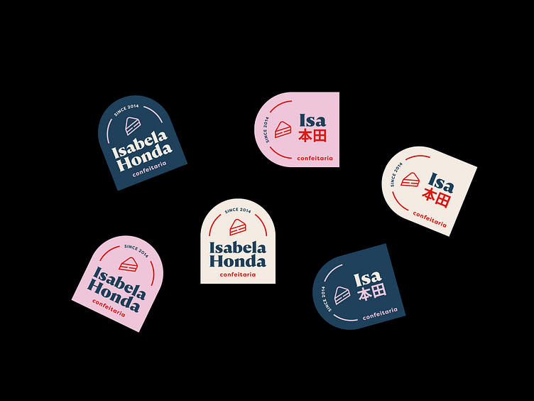
Isabela Honda Confeitaria has been supplying balanced sweets with the best ingredients since 2014. In order to bring modernity and visual appeal to the brand, we created a new visual identity. With contrasted colors and striking typography, the new identity embraces the name of the brand's owner, Isabela Honda, and brings the letter "H" (in its horizontal shape) in the cake icon.The logo has two versions: vertical and horizontal. In its horizontal version, we bring the reduction of the name "Isabela" to "Isa" and put the surname "Honda" in kanji (Japanese language), referring to the owner's ancestry.
More by Bruna Hirano View profile
Like
