Where Travel Dreams Begin (Travelo) - UI Design of mobile app
Unveiling 'Travelo' – Where Travel Dreams Begin! 🌍✈️
Join me on this visual journey as I present a showcase of this mobile app design.
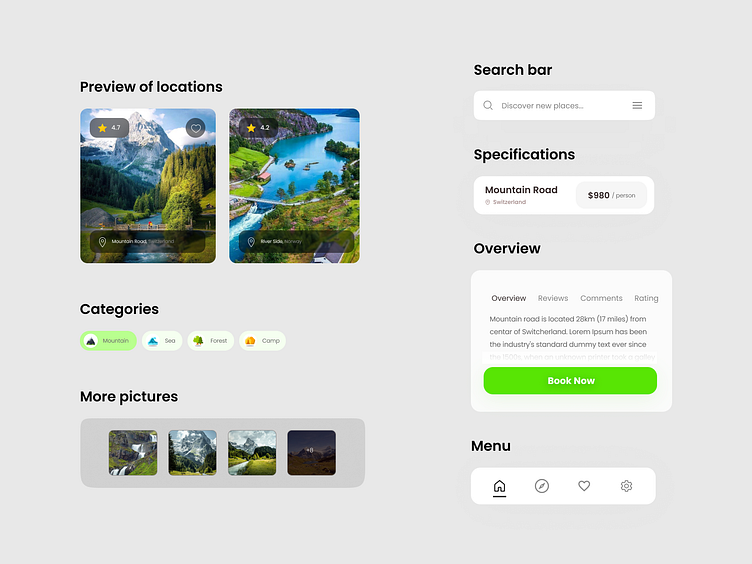
UX Research
Before I started with the design, I tried some Travel apps, and almost every one of them suffers from a lack of space.
They provide too many options at once because they know people have different tastes and want to show something for everyone.
I believe that, just like me, and like most people who complain about it, you also dislike having too many options and getting lost most of the time.
That's why, based on the information I received, I made clear categorization, detailed location display, and simple navigation the primary tasks for this design.
Check out below to see how it turned out:
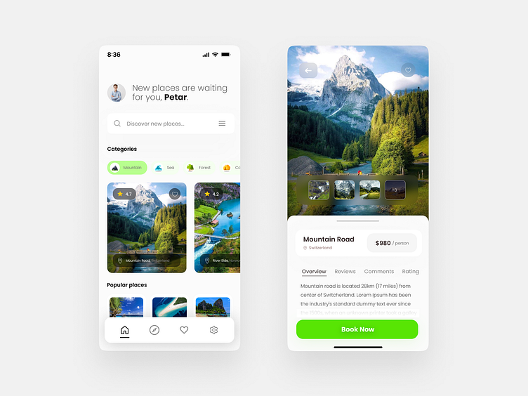
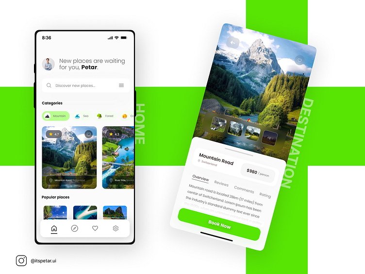
About Design
When it comes to travel, we never want it to look too formal. It should feel friendly, and what color looks better than green, reminiscent of nature.
That's why, in this design, I used a green color with light green accents.
Besides playful colors, I thought that adding a glass effect under the location name, just like the like button, would be a great detail - and it turned out I was 100% right. It added a sense of freshness and a professional touch.
Each element is crafted to perfectly fit the design. No templates were used, unlike what others do.
It's important for the app to have a unique look, otherwise, it will get lost among the sea of similar ones.
-------------------
Have project in mind? Contact me: itspetar.ui@gmail.com