The letter "t"
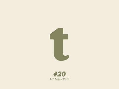
Lowercase, serif(ish). The serif feels a bit too heavy but am happy with the bottom; looks like a more natural curve.
Lowercase, serif(ish). The serif feels a bit too heavy but am happy with the bottom; looks like a more natural curve.