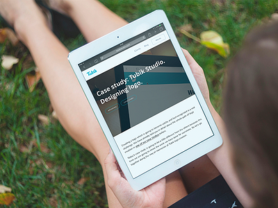
Case Study Tubik Logo
Hi guys! Wish you to have great Monday starting productive and inspirational week!
Do you remember the shot by Arthur Avakyan recently presenting our new logo? Today we have decided to show you much more and reveal all the details of Tubik Studio logo creation. If you want to go through the whole path of logo design, hurry up to read the fresh case study in our Blog! Here we have prepared the full story of all the logo editions with tons of illustrations for the process so that you could follow it from the first sketches to clean and fresh digital version. Welcome to read!
This case shows that creating a logo is the intensive process full of search, inspiration and hard work. Designers of our team are highly responsible when they create logos, lettering compositions and other elements of branding for products and services being aware of their deep symbolic meaning. It doesn't matter what task we work on: UI/UX, interface animation, web design or branding – we always do everything possible to provide the result which will satisfy our customers as well as users of a final product.


