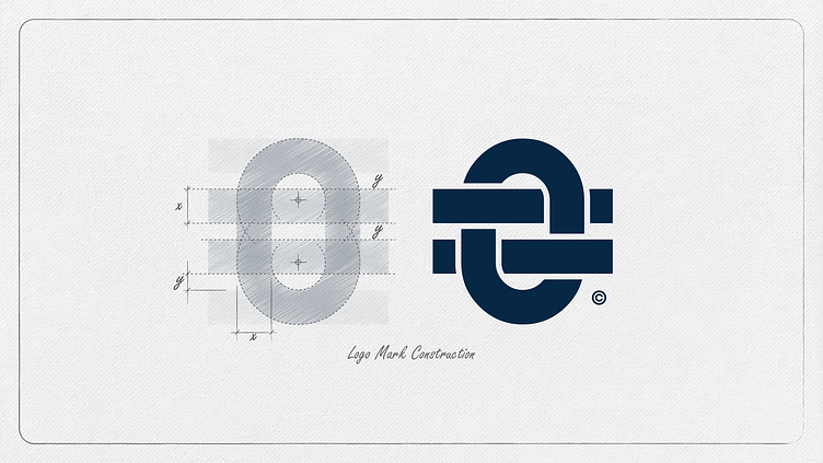
Finding Balance: Unveiling the Construction of the Logo Mark
Take a sneak peek into the process of constructing the logo for "Newcastle's Most Loved Accounting Firm." The minimalist logo mark features an interlaced = sign through a zero, symbolizing the pursuit of balance. As accountants strive to make the books balance, this logo design embodies their mission. The modular design showcases a harmonious relationship between elements, where the thickness of the = sign bars and the width of the vertical lines in the zero is matched.
To further illustrate its meaning, an accompanying artwork showcases a series of numbers extending positively above the zero and negatively below. Construction lines and dimensions are meticulously demonstrated to highlight the thoughtful design process behind this logo creation.
Hit L to support!
___________________________________________________________________________________
___________________________________________________________________________________
Ready to talk / Start a Project ?🚀
Feel free to reach out via Dribbble DM or E-mail:
👉 brendonmcintosh@design-inc.co.za
🛒 Buy my design assets on creative market

