E-Commerce
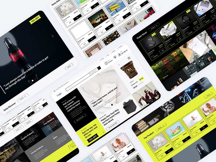
I was thinking a new way of showing products in this e-commerce website. Using blocks and fill in the screen to make it more stylish and modern look. Have a look on the other design in this link https://www.figma.com/file/dM46QfanyScdFSkjGENN6M/E-commerce-Retailer?type=design&node-id=0%3A1&mode=design&t=FV1uU0h8EArkBtqx-1
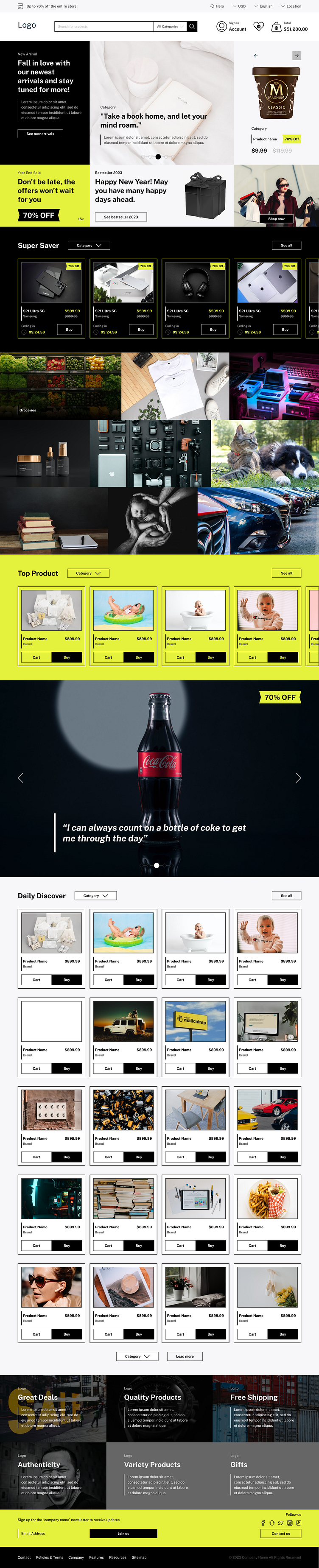
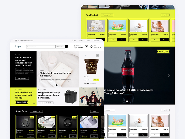
Homepage
The landing page contain everything the company offer. We have the promotion, discounts, features, different type of products, and company values. Main hero banner contain the important things for attracting user and help business side. Design isnpired by instagram explore layout. The design is pack but still easy for user to browse because lack of text and more image unless you hover on some of the components.
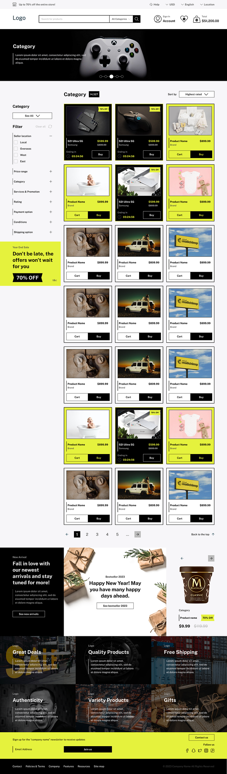
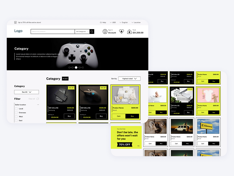
Product Listing Page
Hero banner was for product placement so it could benefit the brand. Layout ratio is 1:3 which we have functions on left and product on right side. Left functions to give user more freedom in finding the products since the product will be in a long lists with 50 products in one page. Long list of product to make user getting hook with the app just like user using social media. When hover on product card there will be a video trailer of the product so user can decide to click on it or not.
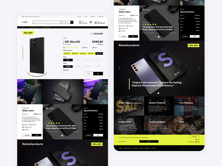
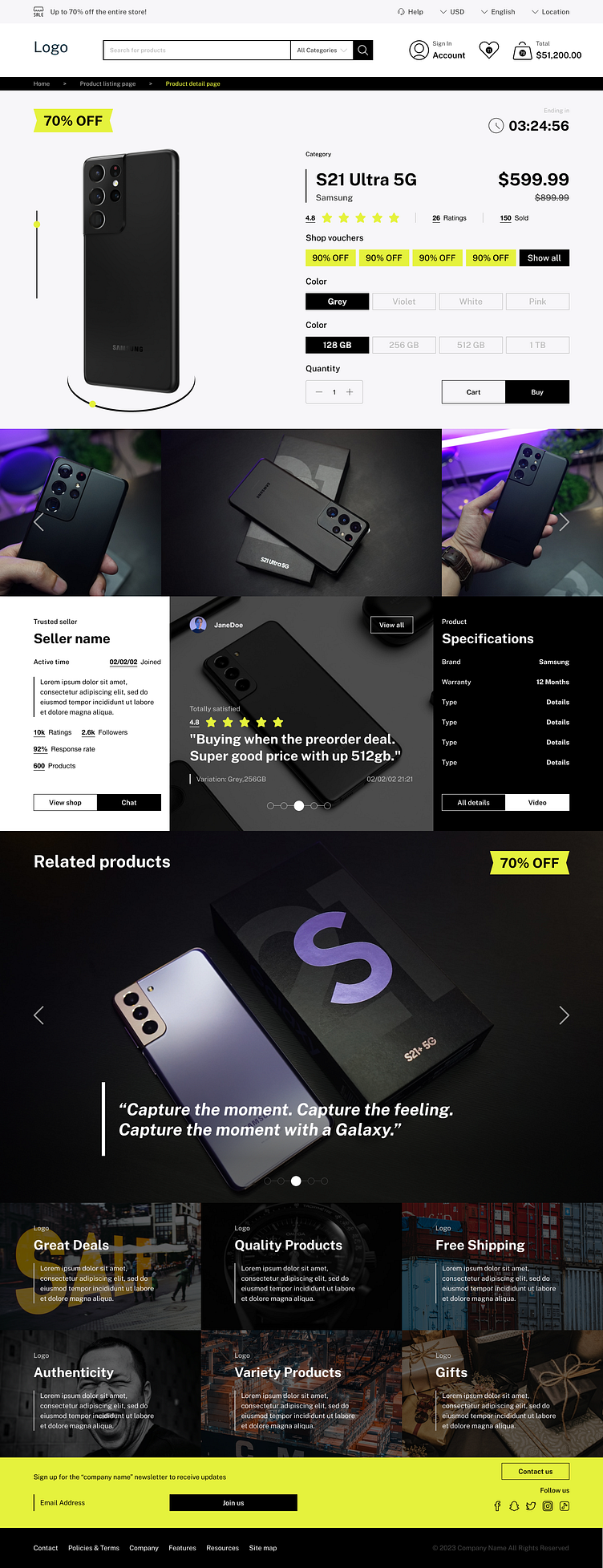
Product Detail Page
User can view the product in 360 the give more details on how it looks like without touching them. Product details include all the options so user can directly choose and add to cart or buy.. Below the product details container is more detailas on the products with images related in one horizontal list, seller details to give assurance to the buyer, the products reviews and product specification. Top 5 reviews will be displayed to encourage user to buy the product. Product specfications include with video of the product on how it can be used, how it looks on human and how it looks in real life.