Elegant Letterhead for Newcastle's Most Est. Accounting Firm
I'm excited to share my first post on Dribbble!
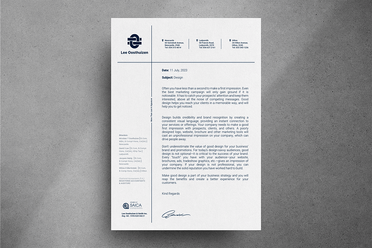
Presenting a glimpse into the elegant letterhead design as part of the transformative journey of "Finding Balance: Rebranding Newcastle's Most Established Accounting Firm." This composition showcases the sophisticated use of diamond Gravure texture paper, a theme that will run cohesively through all the stationary .
These snapshots offer a glimpse into the design layout, providing a taste of the complete transformation. Stay tuned for the full project reveal, where you can witness the journey of finding balance unfold.
The minimalistic approach features a fine and elegant vertical line that gracefully separates the left column, housing important information such as directors, business registration numbers, and the SAICA association logo, On the right side, the body text finds its place.
A horizontal header line gracefully intersects the vertical line, creating a harmonious balance. This design forms a left block where the firm's logo takes center stage, while the right block evenly presents sets of information for the firm's three different office locations.
This thoughtfully crafted layout combines functionality with aesthetics, delivering a professional and sophisticated impression.
Check out the stunning business card design that will be featured next...
Hit L to support!
___________________________________________________________________________________
___________________________________________________________________________________
Ready to talk / Start a Project ?🚀
Feel free to reach out via Dribbble DM or E-mail:
👉 brendonmcintosh@design-inc.co.za
🛒 Buy my design assets on creative market here...


