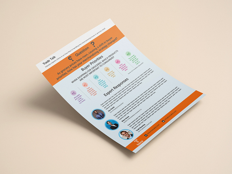
One Pager Design for tosca
tosca was in need of a modern and clean look for their one pager. Something to introduce their team and services in a informative direction. Their main color was orange and to combine the colors in the best way possible was a key point.
Contact us today for your marketing collaterals!
More by Temis View profile
Like
