Meet Aptos 👋, Microsoft's new default font
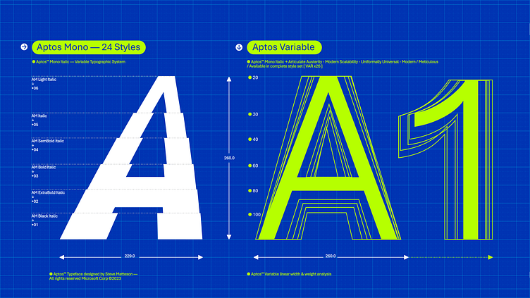
There’s a new font in town 👀! You may remember back in 2021 when we invited you all to help choose our new default font—well, after 15 years, our default Calibri font is finally being replaced by a new font called #Aptos (FKA Bierstadt) ––and the story of its creation is an awesome one. Inspired by a coastal town in California, Aptos is a meeting of old and new with hand-drawn characters brought to life by the latest variable typography technology.
It’s a sans serif design that lies mid-way between the humanist and geometric sans serif style. Commonly known as the Swiss style, Aptos letter forms consists of shapes that are bold, well-defined, directive, yet constrained at the same time. It’s full of clean-cut stem ends and subtle circular squares that allow for higher legibility at varying optical sizes.
To create the font, we worked with type designer, Steve Matteson (he’s been involved in the development of legendary fonts from Times New Roman to our own Segoe) and typographic engineers inside and outside of Microsoft. While Aptos is a sans serif font (shipping with 28 styles), we’re also releasing 🥁🥁🥁 a companion serif and monospaced designs––a first for Microsoft.
Learn more about Aptos at the link below and keep an eye out for Aptos in your font selector soon 👀.
