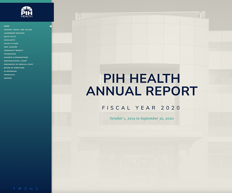
PIH Health Corporate Annual Report
The Problem
The company used to distribute their Corporate Annual Report as a printed booklet and a PDF. As the requests to include more information on it that range from financial statements to donor lists, the increase in production costs and poor reception by general public, we clearly needed to create a new way of distribution.
The Solution
We decided to create the Annual Report as a small website with its own url. This would allow us to better track the readers and get some analytics in place. Also, during production, in some sections where the information would come in last minute, mistakes sometimes were made so having a website where we can make changes on the fly was the perfect solutions for this.
IA
We needed to organize the content and the table of contents from past issue was a good start. The flexibility of Miro, allowed me add information and move things around as needed in a quick and clear fashion.
Visual Style
Being in charge of the look and feel of this project, I decided to start using a Style Tile, a moodboard-like document where I can collect things like a color palette, textures and possible font pairings. This was also a good starting point to create a design system for later reference.
Key data was presented as information cards where the content was previously summarized. Subtle animations were a breeze to add using Webflow on this section and also in the navigation.


