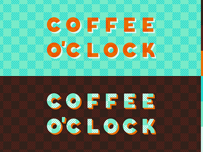
Coffee o'Clock
I've always wanted to design a visual brand for a coffee shop from the ground up, so I decided to take it on as a personal project. This is still an early concept, but I like the idea of playing with the symmetry (and flexibility) of the words and letters, a unique color scheme, and rich patterning.
Because each word here is six letters arranged in a grid, I have plans for a 3x4 vertical orientation as well as a simplified avatar. Thoughts?
More by Sam DeMastrie View profile
Like
