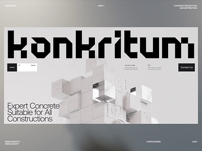
Konkritum Logotype and Key Visuals
Konkritum - Concrete Production and Distribution Company
The idea behind all these was to use simple and sturdy geometric forms to bring thoughts of stability and durability.
There was a desire to show a product as usual and widely known as concrete in a new way, avoiding concrete mixers and safety helmets. So the concrete and glass shapes appeared (:
Got ideas? Let's discuss! https://chipsa.design/
More by Chipsa View profile
Like


