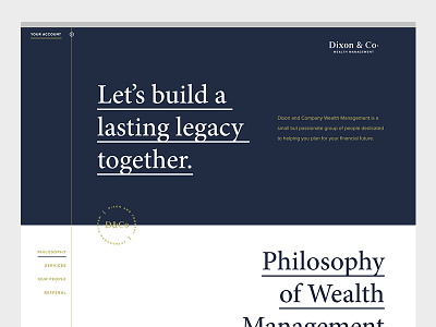
D&Co Website
Here's a website I recently designed. To help differentiate from local competitors I decided to limit photography, and chose to focus solely on making the information interesting and understandable. The result is a website that I feel is both interesting and informative while still fulfilling the clients needs.
Take a look at the Guilloche Icons I designed for this project here.
A more detailed look at the rebrand here.
More by Adam Dixon View profile
Like

