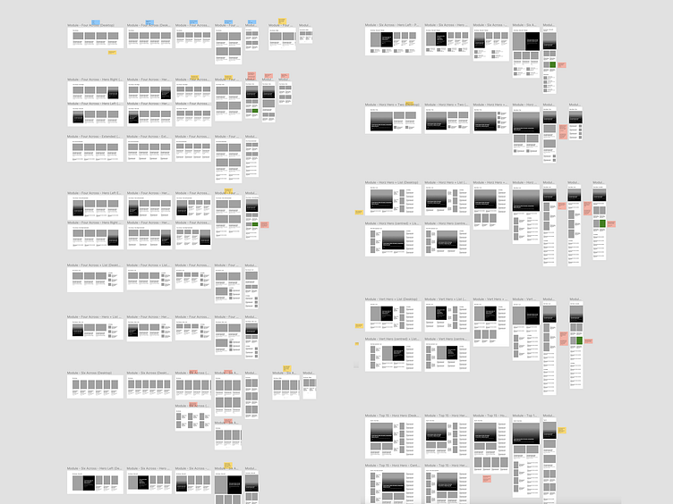
Responsive wireframes
We all know the value of low-fi wireframes before UI design, but how often do you go back to lower fidelity after most of the visual design is done?
Here's a sneak peek into one of my current projects.
After completing all but the final touches of the visual design, I documented a long series of content layout options as wireframes at various responsive breakpoints.
This ultra-focused view proved extremely valuable to myself and other project stakeholders to quickly grasp the challenging decisions we had to make around content management and technical considerations across various device sizes.
More by Benek Lisefski View profile
Like
