WysterujTo.pl - Logo Design 🔌

Logo Design for WysterujTo.pl
Introduction
WysterujTo operates at the intersection of engineering and design, creating high-quality user automation solutions. Their brand identity needed to reflect their innovative and reliable nature, and that's where I came in.
Objective
The goal was to design a logo that captured the essence of WysterujTo - a blend of technological innovation and practical application. The logo had to be typographic, resonating with the brand's modern and robust character.
Design Process
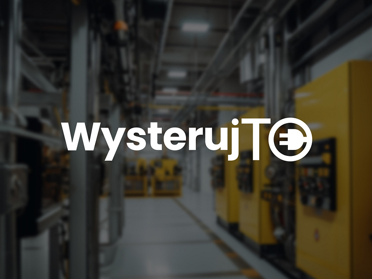
I chose a sans-serif, heavy typeface for the "Wysteruj" part of the logo to evoke a sense of strength and reliability. This part of the logo is black, adding an element of professionalism and seriousness.
The "To" part of the logo is colored in a vibrant shade of orange-yellow. This not only breaks the monotony of the black but also represents the brand's innovative and dynamic nature.
A unique twist was given to the design by integrating an electrical plug into the circular "O". This served as a visual cue for the brand's industry and subtly communicated the essence of their work - making things function.
Result
The final logo is a balanced mix of boldness and innovation. The blend of heavy black typography with a vibrant, illustrative "O" creates a dynamic contrast that captures attention and is easily memorable. The logo succeeds in communicating WysterujTo's dedication to quality, functionality, and innovation in user automation.