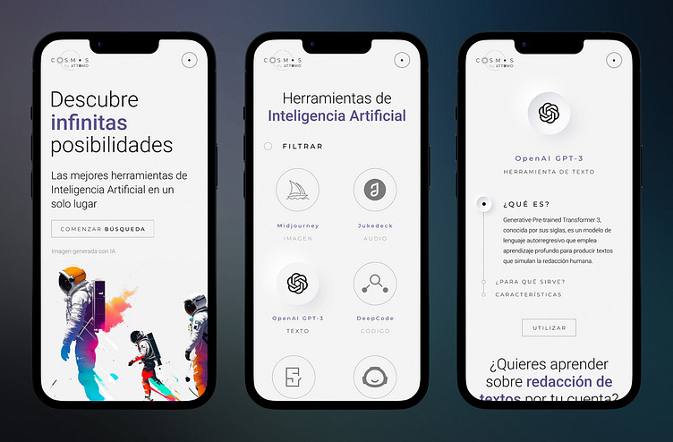
Brand Identity & Web Design for an AI directory platform
An atomic blank canvas design for a world of possibilities: Brand Identity & Web Design for an AI directory platform
First, the corporate identity of the platform was designed as a secondary brand. A new digital product born within another preexisting business. That's why the naming and the aesthetic appear this way.
The brand is related to a whole universe of AI tools waiting to be used to create unexpected connections. More thiner and subtle than its predecessor company, the brand is presented as an atomic multiplier effect. As an exponential discovery.
After the Branding the UI Design of the web was approached.
To test and prove the own purpose of the platform, some parts of the web content, as the images, were created with the help of AI tools. The main example was the homepage's principal picture. Midjourney was asked for "several minimalistic black and white illustrations of an astronaut floating in an empty space, mixed with a world full of colors". The result was adapted through a collage to exemplify the creative and powerful options that AI can manage.
The responsive design was very clean, boosting empty spaces, responding to the idea of the "blank canvas" concept. Like a holder of unlimited things that have not been materialized yet.
Following the minimal approach, a design system was built with all the components, from buttons to typographies. Neumorphism and softer UI CSS shadowing were generated to create kind of galactic crater buttons and boxes, to strengthen the "cosmos" brand identity.
The rest of the web follows this minimalistic line-based style. You can see here (in order from left to right) some cards for a menu, a registration form, a filter and a pop-up window.


