Startup Logo Design
About client
Hireclass helps individuals to become part of the IT industry by providing them with free IT courses tailored to their dream job.
Values that Hireclass brings:
No unnecessary stuff to learn - The courses are designed specifically in collaboration with companies for whose jobs they will apply.
Powered by companies - Recognizing their immense potential, the entire job preparation process is offered to them free of charge.
They are not alone - Throughout the entire process, they will have a dedicated mentor, making their journey personalized and easier.
My idea
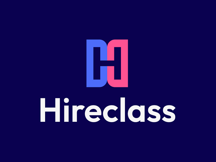
The logo for this startup should merge the benefits for both sides engaged in the business plan: The Company and the Client. That is why the logo is built on the two letters: "C" facing each other. Using different colors additionally represents their differences and is the foundation of the brand image.
Two letters "C" in this shape form the letter "H" in the middle as the whitespace to maintain the recognizable brand even when using black and white variants.
B&W
As I said earlier, the crucial logo part is the whitespace-made letter "H" which will maintain brand recognition even if the colors are not included.
Colors
We have bright, colorful, and modern colors that represent the youth of the people who are in charge of this startup, and the energy which will drive the engaged customers. Primary and secondary colors are always in the same context and they are here to represent the Client and the Company.
Typography
The primary font is Outfit - which will track the innovative beliefs and modern look.
Logo usage
It can be used both on dark and light colors defined in a brand book as well as on top of the gradient mix of blue and pink colors.
It can't be used as a single representation of the blue or pink color, especially on top of each other.


