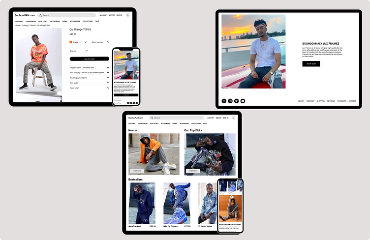
BoohooMAN Redesign
In my recent project, I successfully tackled the task of redesigning the pages of BoohooMAN to enhance the user experience by reducing clutter and improving navigation. Through meticulous research, I gathered valuable user feedback indicating that the website appeared overwhelming with excessive elements, leading to difficulties in navigation. With a user-centric approach, I analysed the pain points and crafted a solution that addressed these concerns. By simplifying the layout, decluttering the interface, and strategically organising content, I created a cleaner and more intuitive design. The revamped pages now offer users a seamless browsing experience, enabling them to effortlessly navigate the website and find the information they need.
