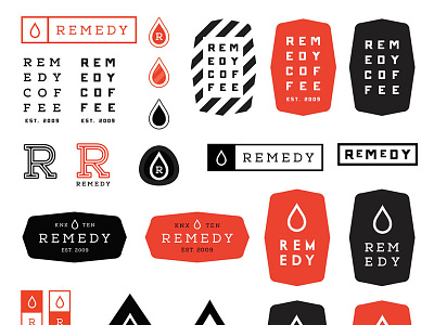
Remedy Coffee Identity Refresh
As I set out to create a new identity for Remedy - the idea of liquids, drinks and refreshment kept churning in my mind. More than just coffee; liquid refreshment.
I also knew that I wanted the new logo to be simple and clean. Thinking of how the logo will be used: on cups, mugs, outdoor signage, online, gift cards, etc - I knew that it had to be easily scalable and look good and legible at small sizes.
Below are few ideas that I have created. I am not sure which one of these we will move forward with, if any, but overall I am happy with the direction so far.
As far as colors, this has been the most tricky part of the redesign. Right now we currently use a two tone logo - just black and white. I like the simplicity this offers and we might continue with this. But I did want to try some colors - I kept getting stuck on trendy salmons and mints and mustards. Not quite sure how I feel about it to be honest.
