Bakery Icons
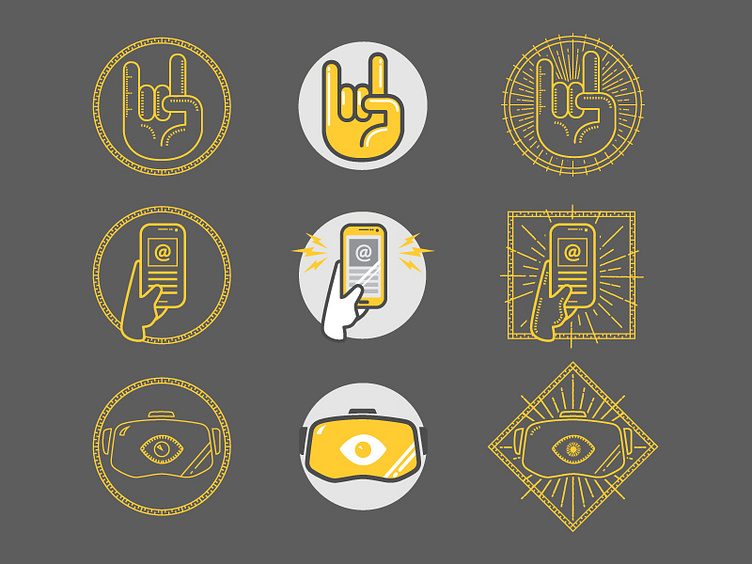
While updating the Bakery brand and website [COMING SOON], we looked at reimagining our icons. As the brand has matured, we wanted to get away from our soft, bubbly style to one which shows we've hit puberty, started using cuss words and have started drinking wine-coolers. We're trouble, man.
Here are a couple examples. Original versions in the middle. Alternates on either side. These ended up getting a little "too illuminati" to use for the final versions.
More by Bakery Agency View profile
Like
