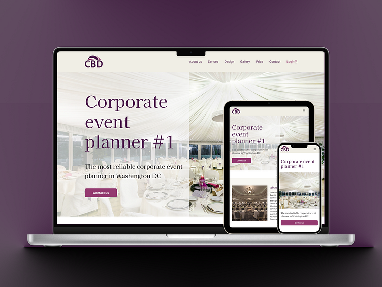
Redesign for the event organization company
I created a redesign concept for the CBD company (Washington, USA) which plans and organizes events at different levels.
What's wrong with the current website of the company CBD?
Not responsive. Many components — little actions.
The information craws at thousands of pages (I didn't count, it's just my feeling:)
A text is read too tricky. There is not enough contrast. The fonts are uncomfortable for users.
You can view the entire case in my portfolio.
Thanks for your attention :)
More by Oksana Tverdokhlib View profile
Like
