Reminder App UI Concept
As a minimalist UI designer, I pride myself on creating clean and intuitive user interfaces that enhance the user experience without overwhelming them with unnecessary clutter. With a focus on simplicity and functionality, I have recently designed a reminder app interface that prioritizes efficiency and ease of use.
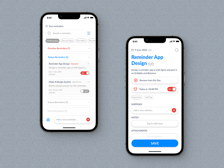
The home screen of the app provides users with a quick overview of their reminders, neatly organized into three categories: overdue, today's reminders, future reminders and chain reminders. By presenting this information at a glance, users can easily stay on top of their tasks and appointments.
To further enhance the user's control over their reminders, I have included an alarm toggle button for each reminder. This allows users to activate or deactivate the alarm associated with a specific reminder, providing them with flexibility and customization.
Recognizing the importance of efficient navigation, I have integrated a search feature into the app, allowing users to quickly find specific reminders based on tags or categories. Additionally, users can take advantage of the filtering functionality to refine their search results, enabling them to locate reminders with precision.
Give me some ❤️ if you like this design.
Wanna Collaborate with Me?
🌏 Visit : www.OntorDesigns.com
🤩 Behance : Nasimul Noyon Ontor
Let's talk about your project
📩 Email : ontor.diupc@gmail.com
⬆️ Upwork : Nasimul Noyon Ontor
Follow me to see more exciting shots and insights on:
Behance I LinkedIn I Facebook I My Website


