LA Fitness - Mobile Redesign
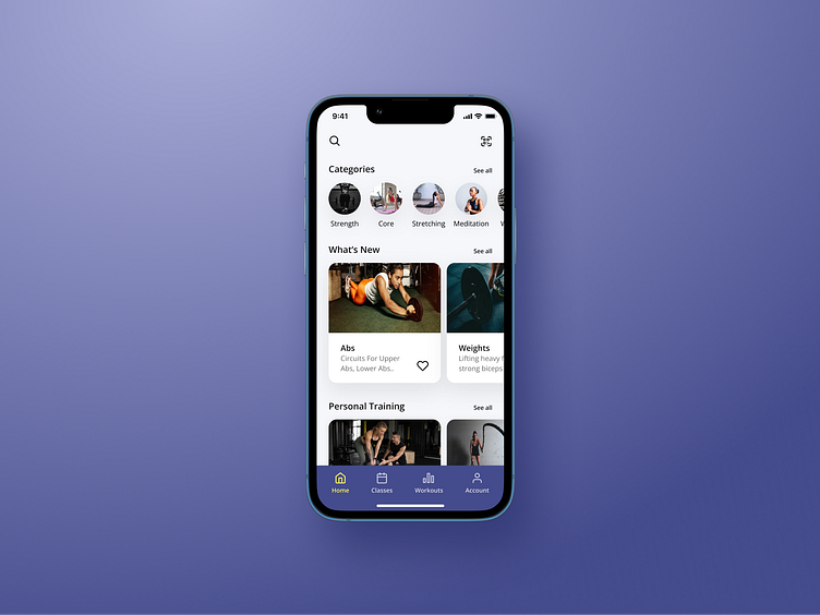
After gathering insights from reviews and surveys, my first priority was to simplify the home screen layout. By adding a bottom navigation, I was able to improve core features, minimize steps and reduce the users cognitive load. Additionally, I added color and type styles to strengthen the apps visual hierarchy.
Upon scanning their membership card at the front desk, users receive a quick notification confirming their check in, allowing them to proceed to the gym and start their workout.
With the visual style and components in place, I had the foundation needed to create a way for people to reserve a class. Now users can easily find information about classes, save their favorites, and reserve them.
For a deeper dive into the complete case study, visit my website: https://alexnelsen.com.


