IKEA iOS App Product Redesign
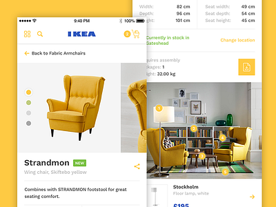
After looking for more furniture on IKEA I decided to have a go at redesigning a product screen in their app.
I wanted to look at how I could bring in more of their beautiful room imagery and help users explore products that work well together across different ranges.
You can see in the iPhone mockup the bar that would stick to the bottom, with the current product, colour and price along with the add to cart button.
Checkout the iPhone 6 Mockup here and the full length version here.
Feedback is always welcome :)
More by Ollie Barker View profile
Like


