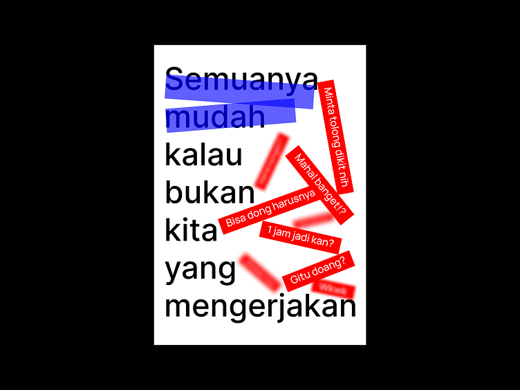
Stacked & Blur Text-Design Poster Design Exploration [070723-BA]
[070723-BA]
— I'm trying to make a poster by arranging the text as if it were an object that can be stacked, overlapped, or looks blurry as if we focus on certain objects. Feel free to leave comments and feedback. And if you find my work useful and you like it, please don't forget to leave love and save it. Also get other latest design updates by following the Sepulang Kantor Project.
[Stay connected with us]
— Instagram: @sepulangkantorproject
— Email: hello.sepulangkantor@gmail.com
More by Sepulang Kantor Project View profile
Like
