Michael Kors: Redesign Explorations #2
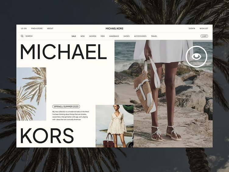
A redesign exploration #2 of the Michael Kors online store based on the homepage hero screen featuring a summer collection.
The intentionally layered and slightly chaotic layout adds a touch of informality to the design. The warm tones of the photography enhance the mockup, creating a sense of a hot, dry summer and establishing a stronger connection with the lightweight summer clothing collection.
Looking for a UI/Visual designer?
Drop me a line: hello@dmitrychernov.com
More by Dmitry Chernov View profile
Like
