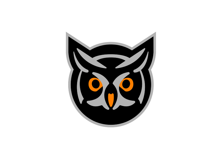
Night Owl Logo
This was a rejected logo symbol for a client called Night Owl Storage. This was the first option presented and meant to feel somewhat like a padlock. It was my favorite symbol from the bunch. You know who to call if you need an owl logo. (That was an intentional pun if you read that last sentence back with emphasis on the 'who' part.)
More by ChangeTheThought View profile
Like
