Michael Kors: Redesign explorations
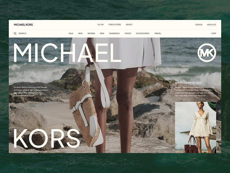
A redesign exploration of the Michael Kors online store is based on the homepage hero screen featuring a summer collection.
The menu background and typography color have a slight warm tone, while the hero image evokes the ambiance of a seaside summer vacation. The open space conveys a sense of freedom.
Looking for a UI/Visual designer?
Drop me a line: hello@dmitrychernov.com
More by Dmitry Chernov View profile
Like
