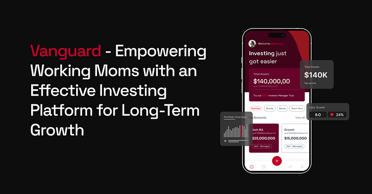
Vanguard - Empowering working moms to easily Invest - Case Study
Who are Vanguard?
Vanguard is one of the world's most respected investment management companies, offering a broad selection of investments, advice, retirement services, and insights to individual investors, institutions, and financial professionals.
Founded in 1975, the Vanguard Group is a global investment-management company. Vanguard is famous for its index funds, as well as its advocacy for a “buy-and-hold,” passive-investment strategy. This philosophy argues that people aren’t very successful when they try to time the market, so it’s best to buy investments and hold onto them for a long time. Because of Vanguard’s historic affiliation with the long-term, buy-and-hold approach to investment, many of its clients follow that passive-investment philosophy.
Chosen Method
The objective is to enhance the onboarding process for investment and create a more engaging platform specifically designed for mothers. Additionally, I aim to make the overall user experience fun and effortless. By improving the onboarding process, we can ensure that mothers feel confident and well-informed when starting their investment journey. To achieve this, the platform will incorporate interactive elements, intuitive features, and user-friendly interfaces. By making investing enjoyable and easy to navigate, we can empower mothers to take control of their finances and make informed investment decisions without feeling overwhelmed.
Investor Manager Tool
The conventional investment process can be challenging as individuals often struggle to determine the most profitable investment opportunities over time. Hence, a hypothesis to explore is whether a new approach that combines budgeting, saving plans, and machine learning can help individuals achieve their investment goals more effectively. This method aims to leverage historical data and user preferences to predict the optimal investment strategy for each individual, providing a set-and-forget approach that is particularly beneficial for busy mothers looking to start investing. By creating a personalized investment plan with clear targets and utilizing machine learning algorithms, this approach can offer a headstart and simplify the investment process for users.
Breakdown of Key Screens
Here is an overview of the three main screens: the primary dashboard, the onboarding screens, and the new investment manager function.
Main Dashboard:
The main dashboard serves as the central hub of the application, with the key feature prominently displayed.
Users can easily access the essential functionalities and monitor their investments from this screen.
Relevant information such as investment performance, portfolio summary, and market trends are presented in an organized manner.
Onboarding Screens:
The onboarding process aims to provide a smooth and informative introduction to new users of the NEW investor feature to help the new users to get started in Investing.
New Investment Manager Function:
The new investment manager function enhances the user's investment management capabilities.
Users can leverage this feature to create and manage multiple investment portfolios, allocate funds, and track their performance.
The function offers intuitive controls and displays comprehensive information, allowing users to make informed investment decisions.
High Fidelity Wireframes
Here are a few mockups showcasing the essential screens, including the onboarding and dashboard screens.
User Feedback
Using a heatmap of the interactions with the prototype, I found that the key feature on the main dashboard was not prominent enough, it got hidden away, also with speaking to some of the users they mentioned they liked this simple feature but wanted it to be more visible so they can utilise it.
Key Components
Key components used throughout the screens, so could be re-used again across the whole app.
Observations
After conducting tests with five selected users, the majority expressed that they found it beneficial to have a target for their investments, as it provided them with a clear understanding of the potential returns in the future.
Although users found the onboarding experience useful, they suggested that it could be more interactive and comprehensive. They felt that while it provided value, it lacked sufficient detail to maximize their results.
For the next iteration, I plan to revisit the onboarding process and delve deeper into understanding the users' key pain points. By addressing these pain points, I aim to enhance the effectiveness of the key feature.
⭐️ Get in touch to work together ⭐️
Portfolio here
Ruminate Studio here


