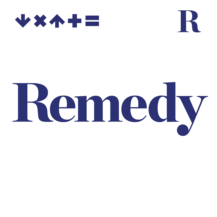
Remedy Custom Logo Type
Remedy is a NY/LA ad agency and production company comprised of four senior partners with specific expertise in strategy, creative, production and sound with the proposition “we know what works and we get there fast.” Problem x solution + talent = Remedy. The logo type needed to reflect experience and quiet confidence. The letter forms (Chronicle) were manipulated to shorten and soften the serifs and the R and Y were additionally shaped for fit and balance. The icon set was developed to work with and apart from the the logotype, individually and as a set. The icons and icon sets are also animated in a variety of combinations while the logotype remains static.
More by Brian Saul View profile
Like
