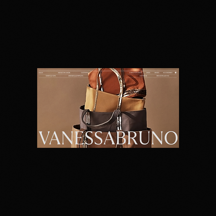
Vanessa Bruno ui exploration
I've decided to lower the extensive text margins from the last project implementing a more modern par interface, not perfect but a stepping stone from previous projects
more info
More by William Zaslav View profile
Like
