Shuddle (IPTS) Design System

Thanks for stopping by and checking out this IPTS → Shuddle design system case study. I’ll keep your visit short, but hope you stay for longer and check out the files 😊
In May, I started the Scaling Design Systems course by Dan Mall here on Dribbble. After learning about the who, what, when, where, and whys of design systems, it was time to put our skills to the test with a capstone project.
We’ve been given 3 weeks to create 3 pages for a fictional company “IPTS”. I’m the Head of Digital here. Spoiler alert: halfway through this process, a rebrand was sprung on us, making us stop in our tracks and pivot toward a new direction.
IPTS
Our three pages to design were:
IPTS Org – Group websites. Has news and media articles etc.
IPTS Travel – Travel booking site.
IPTS Rail – Journey planner and live viewer for routes
In the manner that IPTS was briefed to us, it was understood that there are no design restrictions, and we are fine to go all-out creative in this flow.
Research
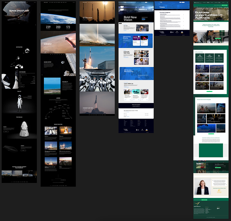
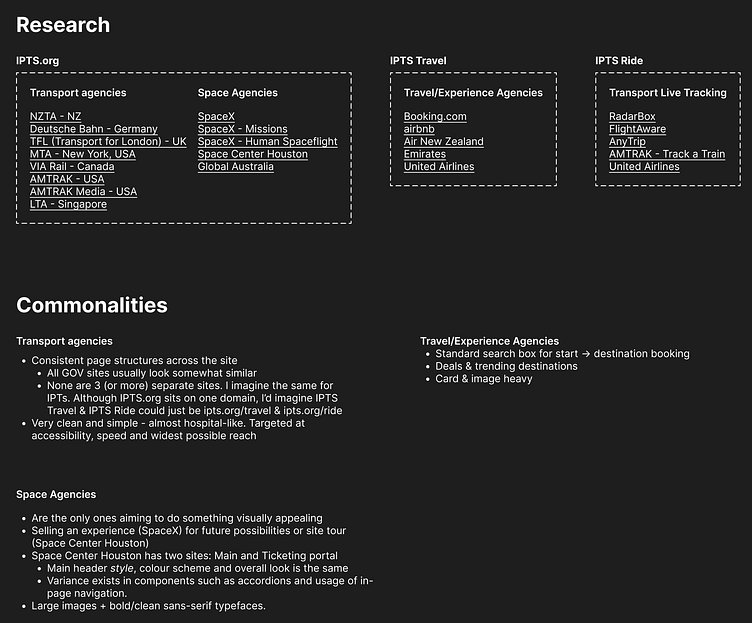
Before embarking on a journey of creating buttons and components, I started looking for inspiration for the page content, look and feel.


Planning
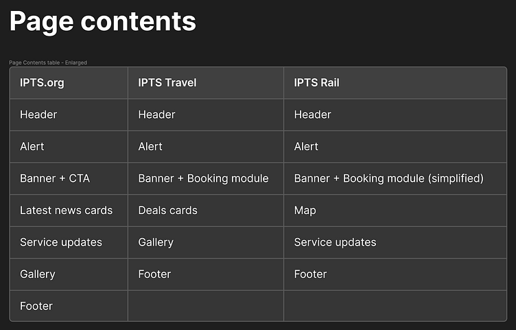
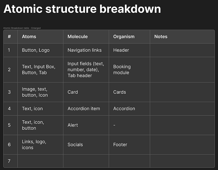
Now knowing what non-fictional sites are doing, I started consolidating what components I wanted to include on this page. Every vein within my body was screaming “hot potato!” however as much as I tried, I kept getting distracted in getting HTML elements to play nice and getting lost in the markup of it all. In order to not let time slip, I was able to follow Brad Frost’s suggestion of using something as simple as a spreadsheet to plan pages as organisms, molecules and atoms.

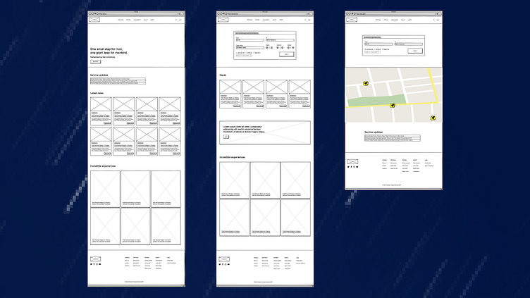
Wireframing
As a structure started forming, I was feeling confident to move to wireframing. I wasn’t trying to be too rigid with this process as I knew things can still change quite a bit once words became rudimentary diagrams (really should’ve stuck with that hot potato process!).
First comps
Wireframes really helped me understand the bigger picture. I worked laterally and on three canvases at once so I could see what patterns are being built as I’m working. This early understanding was key, but I also found myself placing things for the sake of reusability rather than seeking creativity.
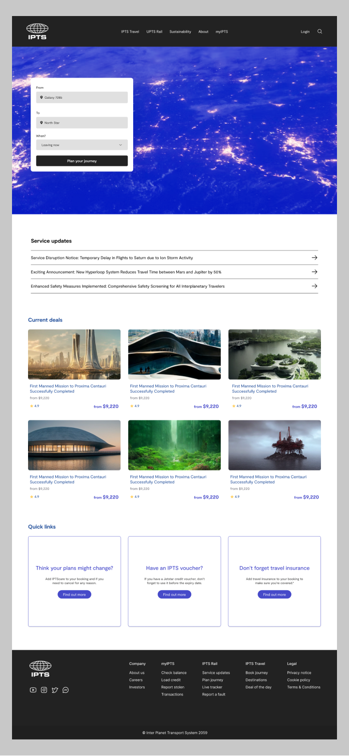
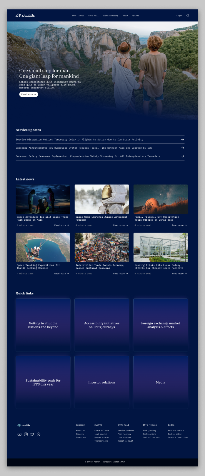
I started creating my first comps based on the above. My goal here was to create really clean, minimalistic pages that took the users right to the information they want. If I were a traveler, I wouldn’t want to land on ipts(.)org and feel lost if I couldn’t get the latest transport details or book a ticket in a hurry.


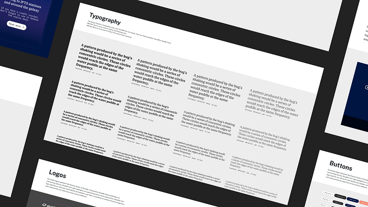
Extracting components
As Dan Mall teachers earlier in the course, starting with “product design” really helped in just getting the content on the screen and worrying about components and design systems later. Having gone through the process and feeling satisfied with the outcome, I now needed to identify and collect any repeating patterns from the designs.
As I was extracting and collating these patterns, I started creating components and placing them back in the designs to pilot the changes and see how they’d fit.

IPTS design system emerges
The pieces were fitting together quite nicely. I was quite pleased with the outcome when I couldn’t tell if a section had been replaced with a design system component or it hadn’t. So to test, I changed the master component’s colour and instantly, the instance updated.
With this done, I was ready to move on to the next step.

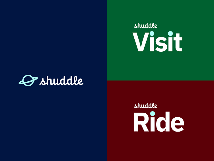
Rebranding to Shuddle
gasp A rebrand?!
Looks like our superiors weren’t happy with the previous IPTS branding and decided to change it up and keep the images a little more light hearted. As the Head of Digital, I had no option but to oblige.
As the Head of Design, I instantly made the executive call that some of the new colours would hardly see the day of light, especially the backgrounds that Shuddle Visit and Ride were placed on. All three pages will have the same feel carry over, and not be themed as if they’re too separate.

Creating a new library
My first action in handling this change was to create another file for this new design system we would be creating. I did this for two reasons - not knowing what changes can and can’t be reversed - the original would stay intact, and to allow developers to easily transition between both design systems. Bonus - and probably also the main reason, I can use Figma’s “Swap library” feature.
I started updating the designs directly by breaking the IPTS components, and applying the new styles so I could get a feel of their fit. This piloting process really helped in making sure I’ve considered all situations and then feel ready to make components.

Rebranded comps
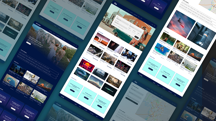


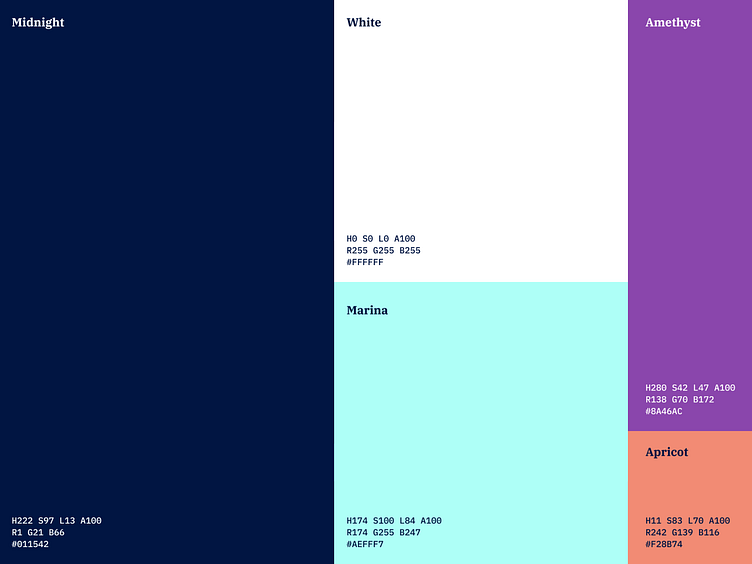
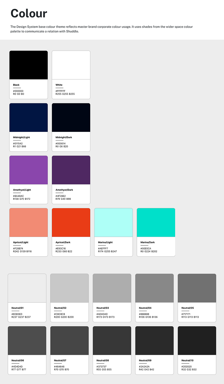
Shuddle design system
Key takeaways
More than anything, I found the process of producing fake content to be the hardest. It’s hard to not treat this like a real product, but an assignment where a 1:1 match to the real world isn’t required. Designing and creating the design system didn’t feel too challenging.
This process really proved that it’s truly never too late to adopt a design system. You could prematurely create a design system too, but taking the learnings away from the course and seeing things we do at work with a fresh perspective is an amazing feeling.
I embraced this project much like I would if I had undertaken such a task at my place of work. Right now, the design system “exists” but it needs more work, but I’ve accepted that this is an iterative process and every little bit of progress goes a long way. I’m very well aware that it could do with better documentation around pairing, colors, and best practices.
Next steps
Work on a v0.2 version of this design system. I want to properly write when and where should certain components be used or write guides around how they should be paired. This is where the polish comes in.
I also want to develop this into an NPM package of shared reusable components.
Put my designer hat back on and address the many issues that the components have, both on an aesthetic and functional level.