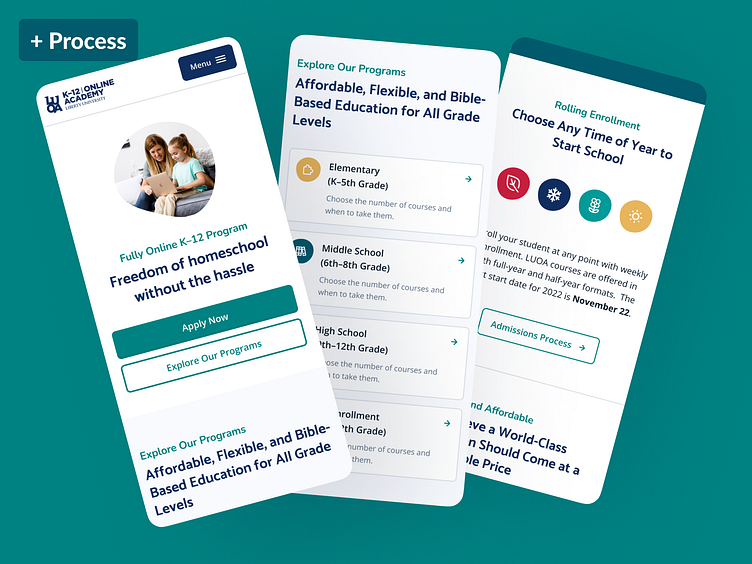
Liberty Online Academy Site
View the live site: Liberty University Online Academy
A new site from the ground up
Our goals for this project:
Completely rebrand the web presence of LUOA
Greatly increase usability via navigation and content structure
Bring top tasks for prospective and current students to the forefront, reducing time to relevant info
Create a flexible design system, building out components in WP Gutenberg so the content team can easily create functional and great looking pages
Post launch: Success!
Time to relevant info was greatly reduced, leads and apps have doubled since launch.
A new process
With this new project, we had a level of freedom that we've never really had before. I took this opportunity to test-drive a new project process.
The process was split into 3 paths initially:
Inventory of current components/design
Brand identity and visual design
UX and information architecture research
This allowed multiple designers to tackle separate parts, with us converging at the end to tackle the high-fidelity designs using everything we previously completed.
Process complete
With minor tweaks along the way, we were able to spend an unheard of (for our team) ~80% of our time up front on developing a design system and establishing the research-backed content structure before ever starting high-fidelity designs.
What usually takes months, now only took a couple of weeks, with quality sky-rocketing as well.


