Snowball Navigation
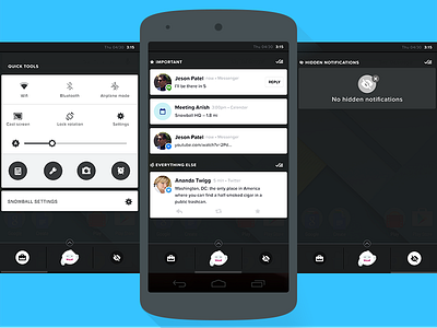
We simplified the navigation of Snowball into
A) Things you want to see quickly and often, and
B) Everything else.
Then the navigation became a lot more simple.
On the right are notifications from hidden apps. This way they are still accessible but not demanding your attention. On the left are quick system tools.
We'll continue to modify the UX as we move forward. Lots we can do moving forward but this was a good first step toward simplifying the core concepts.
More by Joshua Taylor View profile
Like
