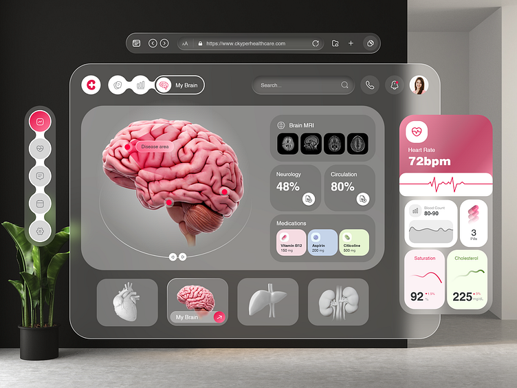
Healthcare Dashboard UI - Apple Vision Pro
Attention Dribbblers! 👋
We are thrilled to showcase an innovative spatial healthcare platform concept that integrates advanced technologies to enhance the telehealth experience for medical professionals and patients. 🩺
With Apple Vision Pro, you can capture magical spatial photos and spatial videos in 3D. 📸🌟
The end users can get to know about their current blood count, heart rate and many more things. 🩺
🎨Color Palette
Here we have used these colors #E61A4F, #FB6E92, #FFFFFF which gives a whole emerging look to the dashboard. 🎨💥
✏️Typography
The concept behind using Helvetica is to create a design that is bold, impactful, and attention-grabbing. 👀
Preview 💥
Hope you guys enjoyed it and have a good day! 🤩
Share some love by pressing ❤️ if you like our design and share feedback!
Don’t forgot to checkout our newly published blog of healthcare- How Does Uber Health Work?
Have an idea? Ping us at: biz@apurple.co 📩💻

