Topauto – CVI
Topauto, an Estonian automotive reseller, recently came to us with a wish to refresh their visual identity with the aim for it to be more representative of their core values. ✨
The rebranding aims to solidify Topauto as the preferred choice for customers and emphasizes transparency, innovation, and sustainability. The goal was to create a brand that resonates with customers and employees, fostering a sense of belonging.
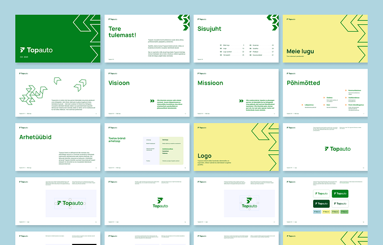
The new primary colors chosen are white and green, representing trustworthiness and safety, which are essential values for Topauto. In addition to white and green, the company also incorporates playful accent colors such as light yellow, orange, light blue, and lime green, symbolizing warmth, openness, joy, confidence, and a sense of adventure. 💛💚
The updated logo combines Topauto’s new logo symbol with the company name, incorporating a T-shape and an arrow to represent growth and ambition. The visual approach of the brand is characterized by angular and geometric elements all working together as a whole! ⬆
Follow us on Behance | Instagram | Facebook
More about us nope.ee and playandnope.com