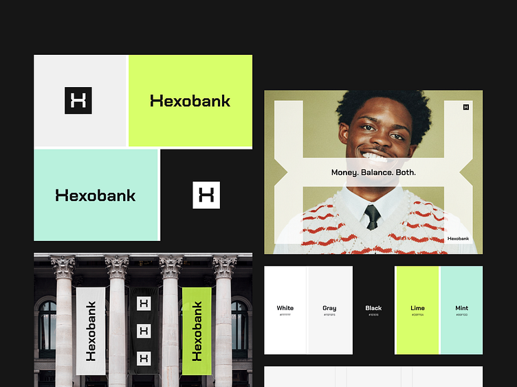
Hexobank - Logo design for the digital bank
Breaking the constraints of the traditional banking system
Hexobank is a representative of a new generation of banking services when convenience and functionality are combined in one application. The task was to reflect the modernity, innovation, and ambition of the product.
Let's take a closer look at how we succeeded with the main task 👇
Logo design
The logo parallels the name, playing with sharp angles and saturation to create an image that is easy to remember and identify from among others.
The stylized letter H symbolizes a sharp blade that cuts off everything superfluous and gives the opportunity to move in step with the times, and the lime color conveys the image of novelty and youth.
The symbolic part of the logo also participates in visual communication as an independent element and, due to the game with scales, creates a recognizable visual style for the company's marketing materials.
Share your thoughts about this project in comments 👉
=========================================
With design and branding, Outcrowd helps to reveal the essence of your brand and transform it into a powerful force that excels in results.
Email us: hello@outcrowd.io
Become a part of Outcrowd communities:


