Data Broker Platform — Responsive Dashboard II
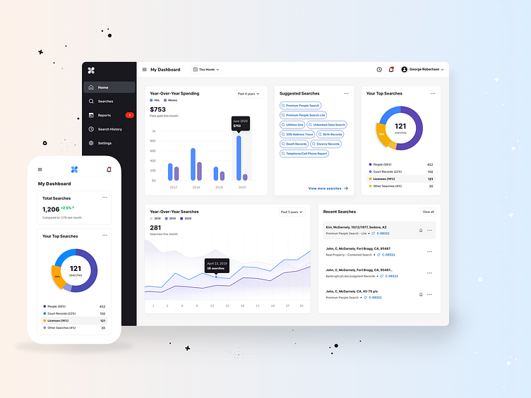
How to design and build a great dashboard
Follow this checklist to help you achieve the results you’re looking for to design a dashboard that clearly communicates your business key goals and metrics.
Be clear about what you're trying to achieve – your dashboard’s purpose will inform its design.
Only include what’s important – everything should support your dashboard’s intent.
Consider data ink ratio – avoid decorative elements that don’t communicate data. That means removing unnecessary grid lines, icons, color, labels, or anything else that doesn’t actually help better understand or communicate data.
Round your numbers – being overly precise can get in the way of important changes.
Use the most efficient visualization – a good visualization should be understood quickly.
Be consistent – using the same visualizations and layouts makes comparing easier.
Group your related metrics – make your metrics easy to find.
Use size and position to show hierarchy – make it clear to the viewer what’s most important.
Give your numbers context – help your viewers know if a number is good, bad, normal or unusual.
Use clear labels for your audience – keep them short and self explanatory.
Remember it’s for people – it’s ok to break the rules if it increases engagement.
Keep evolving your dashboards – check that your dashboard is encouraging the right behavior in your target audience.