Enformion — Mobile Responsive Design II
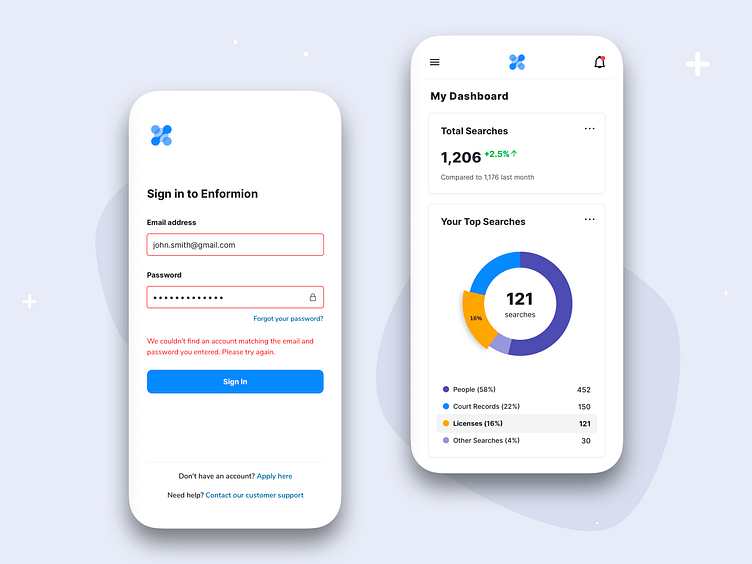
Sharing on the left a Sign-In screen, which not only exemplifies a minimalist aesthetic, but also doesn't shy away from error handling if credentials are not a match. In the event of a login mishap, the email and password fields glare back at you in red, accompanied by a message that nudges you to try again. It's gentle accountability wrapped in a clean interface.
Once you're past the gates, the Dashboard screen unveils itself. This design concept spotlights the 'Total Searches' card to update you on your search counts, and the 'Top Searches' card using a color-coded donut chart to provide a panoramic view of your top searches. Whether it's 'Licenses' selected or any other search category, the chart slice expands to give you a micro-level insight, backed by hard numbers and percentages. All in all, it’s not just data—it's a visual narrative of your operational pulse.
Press 'L' and have your say if you like this shot. Follow me for more!