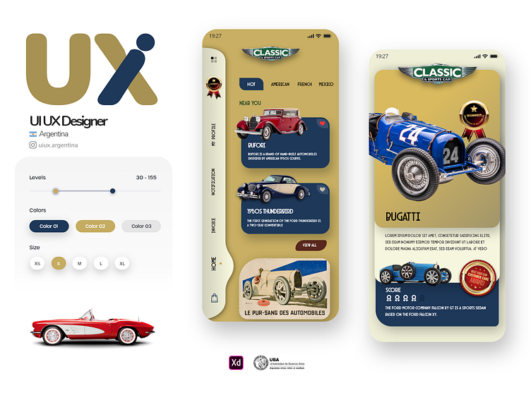
Vintage cars app design
Enter your text here...Hey Dribbblers 👋
Here is the new concept App. Press "L" if you like it ❤️
We are open to new projects!
Navigating Timeless Classics: The Paramount Importance of UI Design in a Vintage Car Catalog App
In the digital era, User Interface (UI) design plays a pivotal role in determining the success of any application. In the context of a vintage car catalog app, a well-crafted UI design will not only aesthetically please the users but also facilitate their journey through the treasure trove of automotive history.
Intuitive Navigation: To ensure a seamless user experience (UX), the app’s navigation must be intuitive. Employing hierarchical design, a side drawer, and a bottom navigation bar helps users to easily browse through the various categories of vintage cars.
Engagement through Visual Elements: As the app deals with vintage cars, it's essential to use high-quality images and possibly videos. By implementing cards, carousels, and grid layouts, the app can showcase the cars in an enticing manner, stimulating user engagement.
Readability and Content Layout: The textual information regarding the vintage cars is as crucial as the visuals. Hence, an effective UI design will ensure the typography, spacing, and text layout are optimized for readability. The usage of typographic scale, white space, and contrast is vital.
Search Functionality and Filters: Integrating a powerful search bar with autocomplete and suggestion features enables users to easily find specific models or brands. Filters like year, brand, and country of origin, are indispensable in an app which catalogs a vast array of items.
Responsiveness and Adaptability: As users might access the app on various devices, it's essential to employ a responsive design. This ensures that whether the app is accessed via a smartphone, tablet, or desktop, the UI elements adjust accordingly for optimal viewing.
Accessibility: Ensuring that the app is accessible to all users, including those with disabilities, is not just ethically right, but can also widen the user base. Employing alt text for images, ensuring keyboard accessibility, and offering text-to-speech functionality are some ways to achieve this.
Consistency and Brand Identity: Utilizing a consistent color scheme and design elements throughout the app establishes a visual language that users can quickly familiarize themselves with. This also strengthens the brand's identity.
Performance: A smooth and fast-loading UI is essential. Optimizing image sizes, employing lazy loading, and ensuring that UI elements are not processor intensive are crucial.
Feedback and Interaction: Providing users with feedback through microinteractions, such as button animations when clicked, or a loading animation, enhances the UX. This can make the application feel more alive and responsive to the user's actions.
Customization: Allowing users to customize aspects of the UI, such as themes or layout preferences, can improve user satisfaction and make the app more personal.
In conclusion, an app featuring a catalog of vintage cars must have a UI design that is not just visually captivating but also functional, accessible, and responsive. This will ensure a delightful and seamless experience for car enthusiasts as they embark on their journey through automotive history.

