IU Health Featured Stories and Events Redesign

This project was completed in 2022 for Indiana University Health
My Role - Product Designer
Tools Used: Sketch
Overview
Our IU Health website utilizes keywords on pages to pull in related providers, locations, news stories, and events. These keywords help provide our patients with relevant information to make well-informed medical decisions and guide them through potentially confusing choices.
The Problem
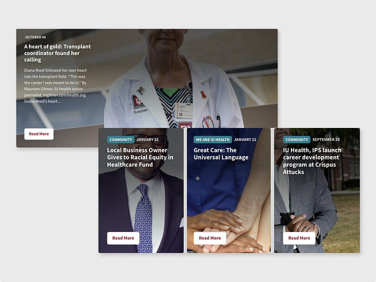
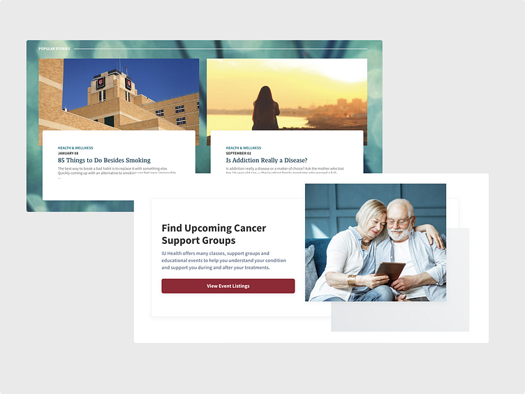
The current design of these modules uses full-size images with a transparent gradient overlay to enhance the contrast between the text and the image.
However, there are issues with this design approach. The images are not custom-made to fit the modules; instead, they are pulled directly from the articles. This leads to images being cropped in unusual ways and makes the text less legible, depending on the image used in the article.
Project Goal
Our goal for this project is to introduce consistency across our site modules by utilizing existing styling. This will enable us to pull images directly from articles while maintaining their aspect ratio. This will result in improved cropping of images and enhanced legibility of the title and description text, meeting accessibility standards.
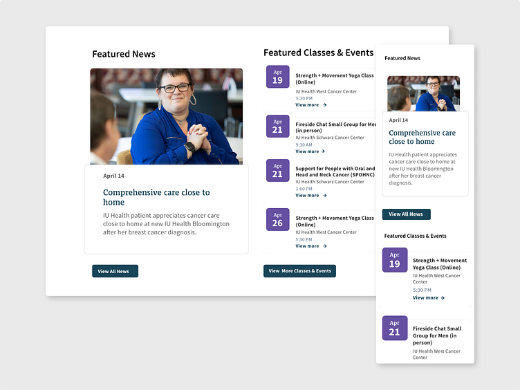
Module Redesign
To begin this project I started by reviewing existing designs on the website, seeking inspiration and aiming to establish consistency within our design system. During this exploration, I observed a callout section for popular stories in the site's blog, where photos were overlaid by a text block positioned in the bottom quarter of the image. Additionally, I referred to our callouts, which also featured a text block overlaid by the image.
After studying these designs, I adapted them to suit the requirements of this project. I separated the images, giving them their own distinct block with rounded corners to match the text box. To differentiate the text box from the main background, I added a subtle drop shadow, while incorporating our existing blog labels and dates at the top of the box. Since the title is now linked and styled in a dark blue color, I removed the "Read More" button and implemented an underline hover effect to indicate its clickability to users.
Upon finalizing the new module design, I created desktop and mobile mockups as references for our developers when implementing the design updates on the site.
Outcome
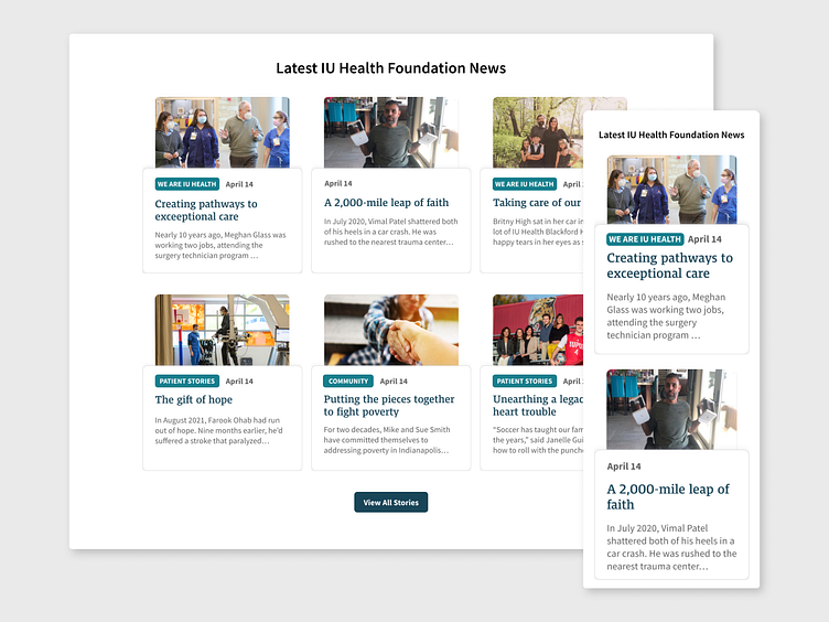
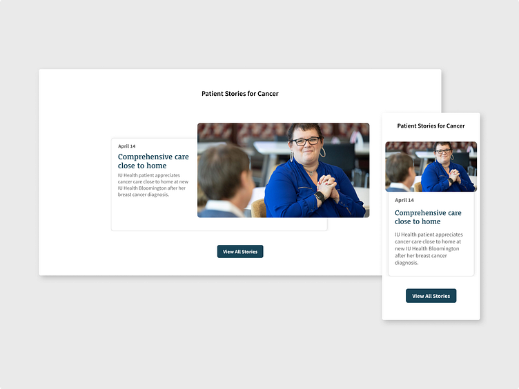
Once this design update was implemented and pushed live, its impact was immediately evident. The update successfully resolved the issues related to images being cropped incorrectly within the modules. By ensuring that the images maintained their aspect ratio and fit properly within the designated spaces, the problem of awkward image placement was effectively eliminated.
In addition, the design update significantly improved the legibility of the title and description text within the modules. The incorporation of the white text box, created a clear visual distinction between the text and the background. This enhancement not only improved the overall aesthetic appeal but also met the accessibility standards for text contrast.
The successful resolution of these design issues and the adherence to accessibility standards demonstrated the effectiveness of the updates. It not only improved the visual consistency across the site modules but also positively impacted the overall user experience.