Simplifying the process of choosing a birth control - Tuune
ROLE: PRODUCT DESIGNER
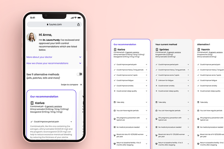
In a week-long sprint, I worked alongside a front-end developer to improve the usability of Tuune's core product offering: a birth control recommendation report.
The catalyst for this sprint was that users were not taking action on our birth control recommendations, despite having completed a 20-40 minute health assessment.
Our approach was to define the metrics for success, scour our existing user research for insights, and make hypotheses on how to improve the experience. We then developed user stories and created prototypes of the design improvements which we tested through Usability Hub.
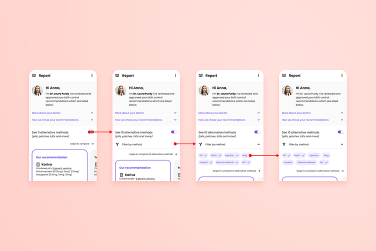
As a user, I want to filter out methods I’m not interested in taking so that I can clearly see my options
Usability testing showed that the redesigned filtering system made it easier for users to navigate the recommendation table and narrow down their preferences.
In production, users spent much more time comparing different methods with the redesign than before, which suggested they were better able to understand and digest the information presented to them.
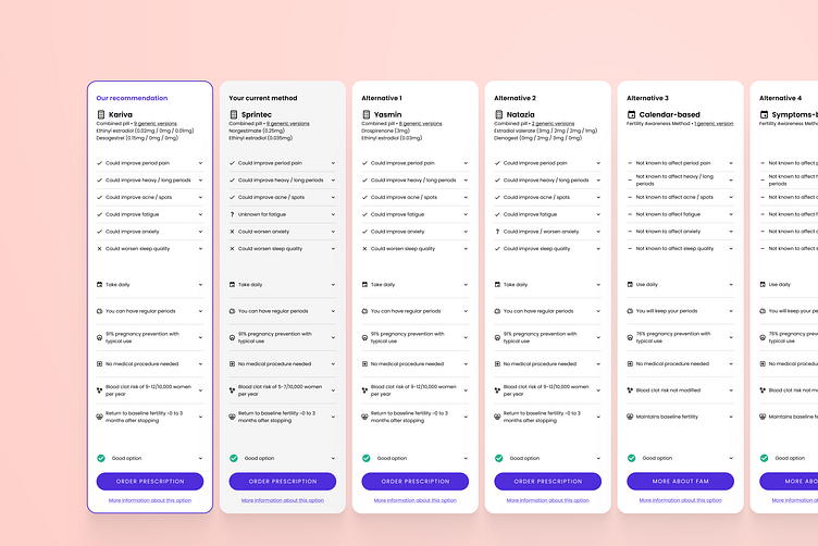
As a user, I want to compare how each method affects my symptoms so I can make tradeoffs based on my preferences
A more sparing use of colour allowed our top recommendation to be highlighted. Users showed an improved understanding of their options and they were able to choose a method based on their preferences.
All 30 test participants were able to order their chosen method independently.
Impact of the redesign
User interaction increased from 9.8% to 33.6% and the number of users reaching the checkout page increased by 300%.
“I think this service offers a quick way to compare different methods. I also like how it provides a recommended method based on my health assessment and has been reviewed by a doctor.”
Usability Hub Participant
