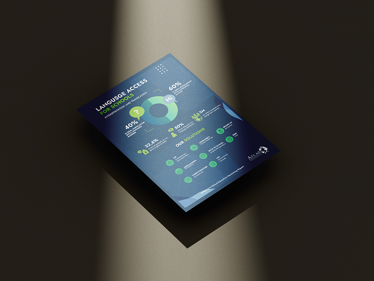
Flyer re-design
A minimalism style flyer design for an English language theme should focus on simplicity, elegance, and visual appeal. The design should use clean lines, simple typography, and minimal use of color to convey a sense of sophistication and refinement. And also use the company's branded colors
Minimalist line icons are simple graphical elements that are commonly used in minimalist design to convey a message or symbol. In the case of a flyer design for an English language theme, using line icons can help to convey key concepts or themes while maintaining the simplicity and elegance of a minimalist style
Minimalist scheduling and charting designs tend to focus on using a limited color palette, clear and concise typography, straightforward icons, and simple patterns. The goal is to make it easy for the audience to quickly grasp what's being shown, without feeling overwhelmed by unnecessary details.

