Papyrus Branding
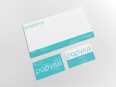
Working on a concept brand identity for a Southern California publishing company. The aqua color with heavy hues of green was chosen to call to mind the Pacific ocean. The name Papyrus was chosen to promote a feeling of establishment or depth in the company, being that original paper was created using the Papyrus plant. Subtle graphics are incorporated of the actual plant to emote delicacy and pay homage to the creation of paper simultaneously.
