Scaling Design Systems Course: A Case Study
Hey Dribbble!
During the Dribbble Scaling Design Systems course, created by Dan Mall, I developed a design system for my final project. This case study explores the creation process of the Design System for IPTS (Interplanetary Travel Syndicate) and how it was applied to build three distinct product pages. Let's dive into the exciting journey of designing for interplanetary travel! 🚀
Project Brief
Create a comprehensive design system to support the user experience across three distinct offerings of IPTS:
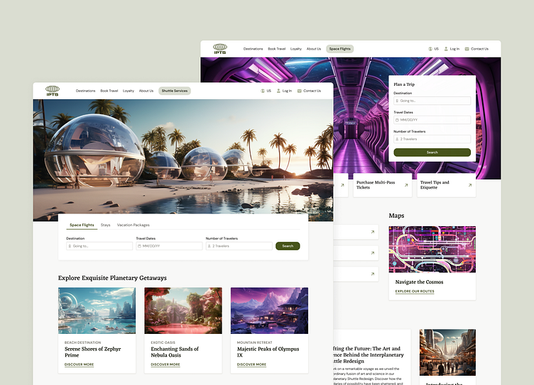
ipts.org: Develop a visually engaging and informative website for IPTS news and updates.
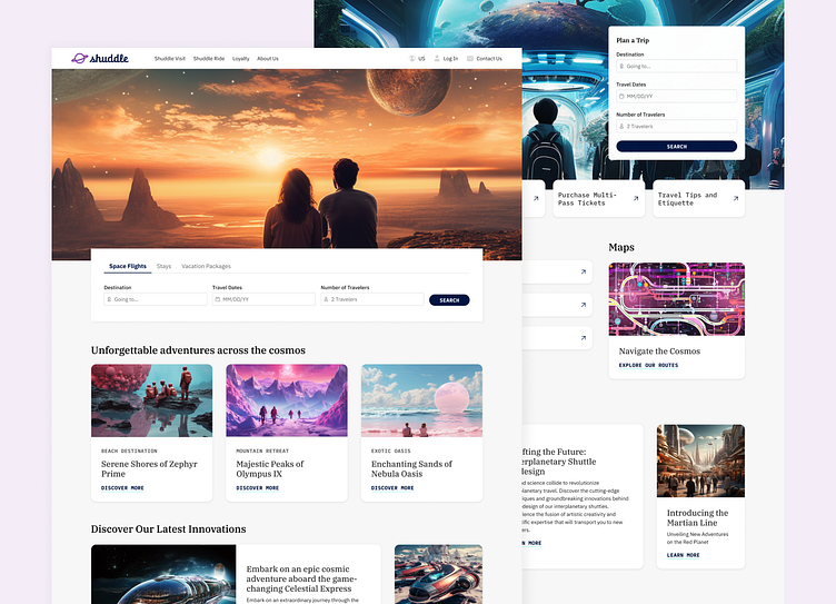
IPTS Travel: Design a user-friendly platform for browsing and booking interplanetary travel.
IPTS Rail: Create a real-time web app for effortless navigation of interplanetary commuter lines.
The design system should ensure consistency in branding, visual elements, and user interactions, providing a seamless and cohesive experience for IPTS customers across all three platforms
Concept and Inspiration
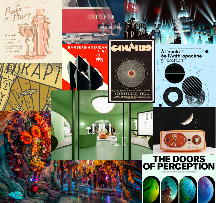
The initial concepts for the IPTS brand was inspired by a blend of the Bioshock video games, retro futurism design, 1950's space age furniture, and the nostalgic vision of space from a bygone era. I was also inspired by my visit to Meow Wolf in Denver and the imaginative representations of space. I created a mood board to capture snapshots of all of these elements.
Design Process
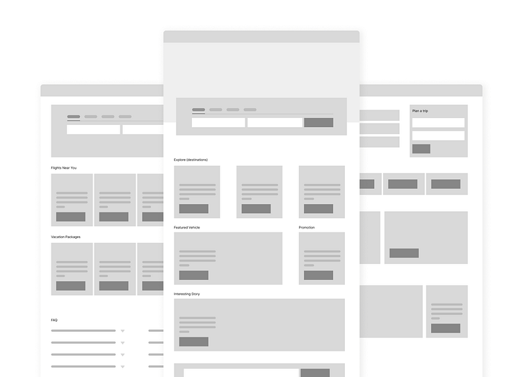
To begin the project, I conducted an extensive audit of luxury travel brands, including Emirates, Belmond, Orient Express, and Aman. This audit served as a source of UI inspiration, leading to a departure from my original concept and inspiring me to create a modern and sleek UI. Furthermore, I explored websites like Google Flights, Booking.com, Expedia, and NYC transit to gather design pattern inspiration. This played a crucial role in identifying the key components necessary for the homepage, such as the navigation, hero section, footer, search feature, cards, and photography styles. With these insights in mind, I created wireframes to outline and visualize the core elements of the design.
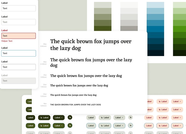
Foundational Elements
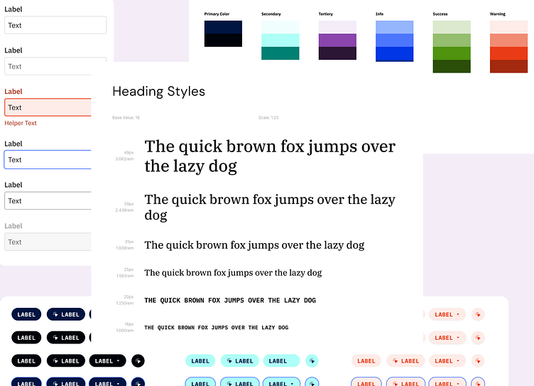
Initially, my focus was primarily on creating components and their variants, neglecting the development of foundational elements. However, I quickly recognized the significance of establishing a visual base. This realization prompted a pivot in my approach, shifting my attention from component creation to the prioritization of foundational elements. These elements included selecting a brand color, creating semantic color palettes and choosing typography. These choices played a pivotal role in achieving visual consistency and provided a solid foundation for the entire system.
AI-Powered Content Generation and Collaboration
During the process, the combination of ChatGPT and Mid-journey aided in content creation and collaboration. Mid-journey enhanced the brand's visual identity by curating photography with specific colors and ambience, capturing the essence of luxury travel to lush, dreamy destinations.
ChatGPT played a pivotal role in generating engaging copy. I could express my ideas for the content blocks in the cards and ChatGPT effortlessly connected the dots, bringing my vision to fruition.
Iterative Refinement and Adaptation
Throughout the page design process, I continually refined and modified the design components. This allowed me to assess their compatibility and flexibility across various contexts. For example, I made a significant adjustment to the neutral palette, transitioning it from cool tones to warm tones, to create a more luxurious and inviting aesthetic. This iterative approach strengthened the overall cohesiveness of the design system and its ability to meet the evolving needs of the IPTS project.
The Solution
The solution I crafted for IPTS involved building the system components and foundations in Figma and documenting them in Zero-height. By utilizing these tools and definitions, I created a flexible and visually appealing system that can be employed for each of the three products in IPTS's product line.
But wait.... there's more.
Embracing Change: The IPTS Rebranding Challenge
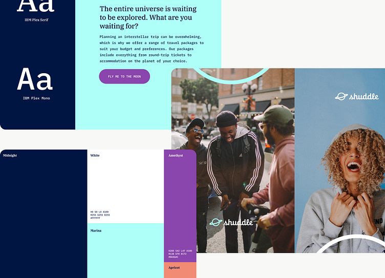
A significant change was introduced when the prestigious branding firm, MegaBrand was hired to rebrand the entire IPTS organization. This rebranding effort brought forth new challenges and considerations that impacted the three products I had been designing using my new system. The redesign aimed to appeal to a younger demographic and changed the company's name to "Shuddle," which represented a fresh and innovative startup approach.
Navigating Rebranding Challenges
To address the rebranding requirements, I began by updating the color styles. This task presented challenges in integrating the new bold colors into the design framework while ensuring accessibility and maintaining a cohesive UI. I curated the color palette, limiting the usage by decreasing available shades to minimize visual noise and to preserve the hierarchy of elements. Some colors were repurposed as semantic colors, such as using shades of "Midnight" for information-related components and introducing the "Apricot" color for errors. I created shades leveraging lightness in HSL, to achieve desired variations. After adjusting the colors, I evaluated and update the components to ensure their seamless adaptation to the new brand.
I made a few changes at this point such as adding more corner radius to certain components to align with the sense of playfulness in the desired brand image.
Updating the type guidelines was pretty straightforward. Instead of relying solely on the type given, a serif and a monospace font, I integrated the IBM Sans family for body copy. For headings, I explored a combination of the new serif and monospace fonts to achieve enough variation, and create a balanced, visually interesting mix of fonts.
Furthermore, the rebranding effort meant I needed to reconsider imagery and copy. I sought inspiration from platforms like Contiki, which catered to a younger demographic, for imagery and copy that resonated with the target audience. I used my good ol' AI pals to do the imagining.
My Takeaways
Throughout the rebranding process, I gained an appreciation for the efficiency of design systems. The task of implementing these changes was surprisingly swift, requiring only a few hours to rebrand the system and the associated products. The initial investment of establishing a flexible design system proved invaluable, as it facilitated seamless adaptation.
The experience also demonstrated the need to strike a balance between designing for a trendy, young audience and adhering to accessibility guidelines and best practices in design. It highlighted the importance of considering diverse user needs and ensuring that the design remains inclusive and user-friendly.
This whole journey reinforced the significance of thorough upfront work in crafting a comprehensive design system. It also emphasized the ongoing evolution of design systems to effectively accommodate future changes and maintain their relevance and efficiency over time.