System Status Tool Explorations (MacOS)
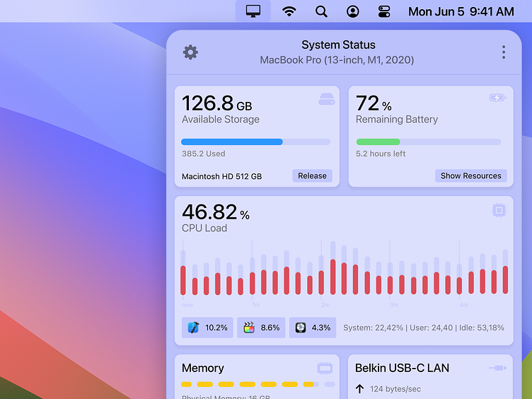
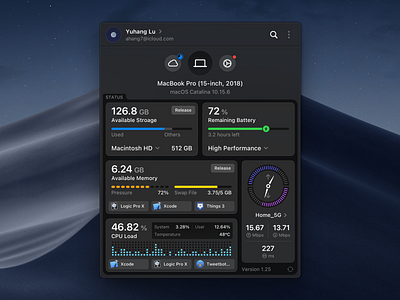
Revisiting an old design from the amazing @yuhang to sharpen my more subtle GUI skills.
I specifically loved the idea of showing the most consuming apps right in the tool / widget with their app logo for an instant overview of system impact.
Wanted to try my hand at a cross between Apple's system settings and a tool like MacPaw's Clean My Mac menu.
Some considerations:
CPU load: flows right to left chronologically, like in Activity Monitor, but the background grid cutoff on the right still feels a bit 'off'.
Colors: In MacOS Activity Monitor, CPU load is a blue and red combo graph, i chose grey here for secondary color, but obviously, there is a reason for this choice. So probably a rookie move :)
Release button from HD is only an option from an external hard-drive. Wondering if i should show it in fixed HD.
Icons: Used the SF icons here, only changed the memory icon slightly. But like CleanMyMac (a subtle blur) these should be a little more custom in future versions.
Font: SF Pro
Icons: SF Icons
For more work and experiments:


