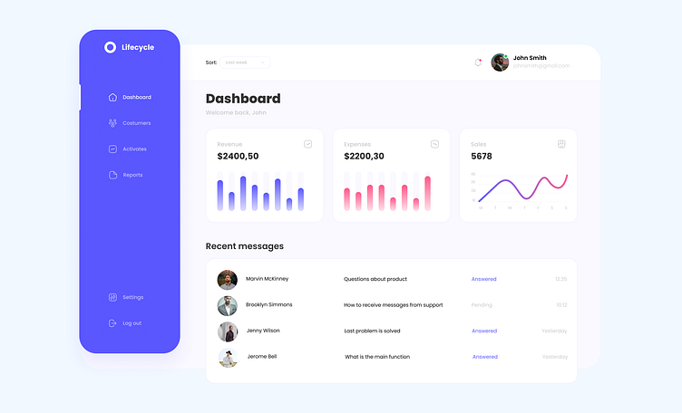
DailyUI #018 - Analytics Chart
DailyUI #018 - Analytics Chart
Hello everyone!❤️
So, Here is the output of daily UI Challenge day 018.
Challenge: Design an analytics chart. Is it to be used for web or app analytics.
I decided to design a modern dashboard UI in Figma including line chart, column chart or vertical bar chart.
Dashboards are a powerful opportunity to influence user behavior and boost retention rates. By using the data collected through research, designers can create a dashboard that displays actionable and relevant data. For this to happen, the dashboard information needs to be easy-to-scan and contain only the key information.
Dashboards give users access to relevant information. Their main purpose is to resolve the frequently asked questions within a short timeframe. With that in mind, use the five-second rule.Well, keep in mind that a user will be willing to spend five seconds to find the information they need.
Does your dashboard provide this?
If it doesn’t, this might be the reason for the low app retention rate problems you’re facing.
