Octicons
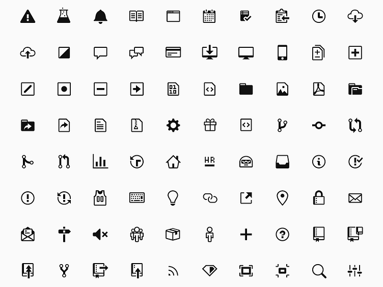
GitHub uses an icon font. It's called Octicons. This is a redrawing of most of those icons meant to address the following:
1. Better legibility at 16px 2. Consistency in line weight 3. Consistency in corner radii 4. Consistency in perspective
Still a long way to go for consistency. I'd love to have independent 32px and 16px glyphs. Lots of sacrifices were made for the 16px grid.
I'd also love to implement with SVG if it make sense at GitHub's scale.