Cricket Victoria Website Redesign
Introduction
Cricket Victoria, a leading cricket organisation in Australia, sought to revamp its online presence to better serve its audience and stakeholders.
The organisation partnered with 23 Digital, a digital agency specialising in web design and development, to undertake this project.
The goal was to create a user-friendly, visually appealing, and functional website that would cater to the diverse needs of Cricket Victoria's audience.
This case study will delve into the process, challenges, and solutions that defined this project.
Project Overview
The project's primary objective was to create a website that would provide an engaging and seamless user experience for cricket fans, players, and stakeholders.
The website needed to be easy to navigate, visually appealing, and packed with useful features that would cater to the needs of the diverse audience.
Research
23 Digital began the project with a comprehensive research phase.
They studied the existing website, analyzed user behavior, and gathered feedback from users.
They also studied the websites of other sports organisations to understand the best practices in the industry.
This research helped them identify the pain points of the existing website and set the direction for the redesign.
Design
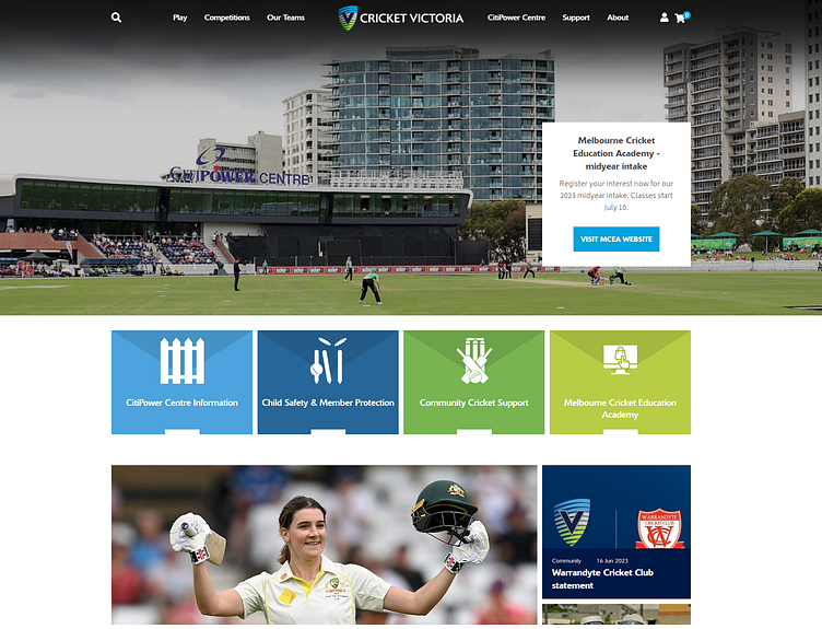
Based on the research, 23 Digital designed a clean, modern, and intuitive user interface.
The design was focused on simplicity and ease of navigation. The homepage was designed to provide quick access to the most important sections of the website, such as news, events, and player profiles.
The use of large, high-quality images added visual appeal and helped to create a strong connection with the audience.
Development
The development phase involved creating a responsive website design that would provide a seamless experience across different devices.
The website was built using the latest web technologies to ensure fast loading times and smooth performance.
Special attention was given to the website's mobile version, considering the growing trend of mobile internet usage.
Testing and Iteration
Once the initial version of the website was ready, it was tested extensively to identify any issues or areas for improvement.
The testing phase involved both technical testing (for issues like broken links or slow loading times) and user testing to gather feedback on the user experience.
Based on the feedback, several iterations were made to refine the design and functionality of the website.
Results
The redesigned Cricket Victoria website was well-received by users and stakeholders.
It provided a much-improved user experience, with easy navigation, visually appealing design, and useful features.
The website also saw an increase in traffic and user engagement, indicating the success of the redesign.
Conclusion
The Cricket Victoria website redesign project is a great example of how a well-planned and executed UI/UX design process can significantly improve a website's user experience.
By focusing on the needs of the users and continuously iterating based on feedback, 23 Digital was able to create a website that not only met but exceeded the expectations of Cricket Victoria and its audience.
The project's primary objective was to create a website that would provide an engaging and seamless user experience for cricket fans, players, and stakeholders.
The website needed to be easy to navigate, visually appealing, and packed with useful features that would cater to the needs of the diverse audience.

