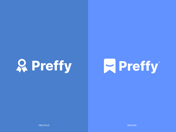
Preffy - Logo Redesign
Preffy is an innovative platform that elevates music competitions to new heights. With a mission to empower artists, Preffy hosts captivating contests where participants vie for the title of the most liked or most creative video featuring a designated song.
View full case study on Behance.
Our approach to Preffy's visual identity was centered around capturing the platform's vibrant and empowering essence. We wanted to create a brand that resonated with artists and celebrated their creative expression. In line with this vision, we developed a logo and icon that aligned seamlessly with Preffy's mission. Drawing inspiration from the concept of a ribbon, symbolizing achievement and rewards, the redesigned logo exudes a sense of competition and triumph. Its minimal yet abstract design captures the core essence of the platform, while spreading joy and happiness through its playful energy.
To complement the logo, we carefully selected a vibrant color palette, incorporating shades of blue. These shades evoke a sense of creativity and inspiration, creating an inviting and engaging visual experience for Preffy users.
-
We're Outcraft Agency
Outcraft is a team of multidisciplinary digital product experts focused on branding, UI/UX design, mobile, and web development. We are passionate about creating something great with our clients and customers, building up value from ideation to launch.
Check us out at www.outcraft.io
Let's work together!
Let's connect!

